// Testimonial Ads — content sections, part 1:
//   PcProof          social proof: editorial quote + logo wall
//   PcWhatYouGet     "What you actually get" feature grid
//   PcWhoFor         "Who this works best for"
//   PcOperational    operational rule band

// Local line-icon set (1.5px, currentColor — never pink).
const FS = { fill: "none", stroke: "currentColor", strokeWidth: 1.5, strokeLinecap: "round", strokeLinejoin: "round" };
function IcClip({ s = 24 }) { return <svg width={s} height={s} viewBox="0 0 24 24" {...FS}><rect x="3" y="5" width="18" height="14" rx="3" /><path d="M3 9h18M8 5l-1.5 4M14 5l-1.5 4" /><path d="M11 11.5v5l4-2.5z" fill="currentColor" stroke="none" /></svg>; }
function IcQuote({ s = 24 }) { return <svg width={s} height={s} viewBox="0 0 24 24" {...FS}><path d="M9 7H5a1 1 0 0 0-1 1v4a1 1 0 0 0 1 1h3v2a3 3 0 0 1-3 3" /><path d="M19 7h-4a1 1 0 0 0-1 1v4a1 1 0 0 0 1 1h3v2a3 3 0 0 1-3 3" /></svg>; }
function IcTarget({ s = 24 }) { return <svg width={s} height={s} viewBox="0 0 24 24" {...FS}><circle cx="12" cy="12" r="8.5" /><circle cx="12" cy="12" r="4.5" /><circle cx="12" cy="12" r="1" fill="currentColor" stroke="none" /></svg>; }
function IcLayers({ s = 24 }) { return <svg width={s} height={s} viewBox="0 0 24 24" {...FS}><path d="m12 3 9 5-9 5-9-5 9-5Z" /><path d="m3 13 9 5 9-5" /></svg>; }
function IcFilm({ s = 24 }) { return <svg width={s} height={s} viewBox="0 0 24 24" {...FS}><rect x="3" y="4" width="18" height="16" rx="3" /><path d="M7 4v16M17 4v16M3 9h4M3 15h4M17 9h4M17 15h4" /></svg>; }
function IcZap({ s = 24 }) { return <svg width={s} height={s} viewBox="0 0 24 24" {...FS}><path d="M13 2 4 14h7l-1 8 9-12h-7l1-8Z" /></svg>; }
function IcCheck({ s = 18 }) { return <svg width={s} height={s} viewBox="0 0 24 24" fill="none" stroke="currentColor" strokeWidth="2.2" strokeLinecap="round" strokeLinejoin="round"><path d="M5 13l4 4L19 7" /></svg>; }

// What-you-get delivery icons — explain the system, not decorate.
function IcAngle({ s = 22 }) { return <svg width={s} height={s} viewBox="0 0 24 24" {...FS}><path d="M4 5h16a1 1 0 0 1 1 1v7a1 1 0 0 1-1 1h-9l-4 3.2V14H4a1 1 0 0 1-1-1V6a1 1 0 0 1 1-1Z" /><circle cx="11.5" cy="9.5" r="2.4" /><circle cx="11.5" cy="9.5" r="0.6" fill="currentColor" stroke="none" /></svg>; }
function IcEdit({ s = 22 }) { return <svg width={s} height={s} viewBox="0 0 24 24" {...FS}><path d="M3 7.5h18" /><rect x="5" y="5.5" width="5" height="4" rx="1" /><path d="M15 5.5v4" /><path d="M3 13.5h13M3 17.5h9" /></svg>; }
function IcFrames({ s = 22 }) { return <svg width={s} height={s} viewBox="0 0 24 24" {...FS}><rect x="2.5" y="5" width="4.5" height="14" rx="1" /><rect x="9" y="8.5" width="6" height="7" rx="1" /><rect x="17" y="10" width="5.5" height="4" rx="1" /></svg>; }
function IcDone({ s = 22 }) { return <svg width={s} height={s} viewBox="0 0 24 24" {...FS}><rect x="4.5" y="3.5" width="15" height="17" rx="2.5" /><path d="M7.8 9l1.5 1.5L12.4 7.4" /><path d="M7.8 15l1.5 1.5L12.4 13.4" /><path d="M14.5 9.2h2.4M14.5 15.2h2.4" /></svg>; }

const PC1_CSS = `
  /* social proof */
  .pc-quote { font:600 clamp(28px,3.6vw,46px)/1.16 var(--font-sans); letter-spacing:-0.03em;
    color:var(--text-primary); margin:0; max-width:20ch; text-wrap:balance; }
  .pc-logos { display:grid; grid-template-columns:repeat(5,1fr); border-top:1px solid var(--line); border-left:1px solid var(--line); }
  .pc-logocell { border-right:1px solid var(--line); border-bottom:1px solid var(--line); padding:20px 22px;
    display:flex; align-items:center; justify-content:center; min-height:108px; }
  .pc-logocell .wm { font:600 19px/1.1 var(--font-sans); letter-spacing:-0.02em; color:var(--text-tertiary);
    filter:grayscale(1); opacity:.8; transition:color .2s, opacity .2s; text-align:center; }
  .pc-logocell:hover .wm { color:var(--text-primary); opacity:1; }
  .pc-logocell img { max-width:78%; max-height:48px; object-fit:contain; filter:grayscale(1); opacity:.78; transition:opacity .2s, filter .2s; }
  .pc-logocell:hover img { opacity:1; filter:grayscale(0); }

  /* feature grid */
  .pc-feats { display:grid; grid-template-columns:repeat(3,1fr); gap:16px; background:transparent;
    border:none; border-radius:0; overflow:visible; }
  .pc-feats.cols2 { grid-template-columns:repeat(2,1fr); }
  .pc-feat { background:#fff; border:1px solid var(--line); border-radius:16px; box-shadow:var(--shadow-card);
    padding:30px 28px; display:flex; flex-direction:column; gap:13px;
    transition:transform .28s cubic-bezier(.2,0,0,1), box-shadow .28s cubic-bezier(.2,0,0,1); }
  .pc-feat:hover { transform:translateY(-4px); box-shadow:var(--shadow-lift); }
  .pc-feat-ic { width:44px; height:44px; border-radius:12px; background:var(--bg-grey); display:flex; align-items:center;
    justify-content:center; color:var(--text-primary); flex:none; }
  .pc-feat h4 { font:600 21px/1.25 var(--font-sans); letter-spacing:-0.02em; color:var(--text-primary); margin:4px 0 0; }
  .pc-feat p { font:400 15.5px/1.5 var(--font-sans); color:var(--text-secondary); margin:0; }
  .pc-feat ul { list-style:none; margin:2px 0 0; padding:0; display:flex; flex-direction:column; gap:9px; }
  .pc-feat li { display:flex; gap:10px; align-items:flex-start; font:400 15px/1.4 var(--font-sans); color:var(--text-primary); }
  .pc-feat li .b { flex:none; width:6px; height:6px; border-radius:999px; background:var(--brand-600); margin-top:7px; }
  .pc-feat li b { font-weight:600; }
  .pc-feat .meta { margin-top:auto; padding-top:16px; display:inline-flex; align-items:center; gap:8px;
    font:500 13px/1.3 var(--font-sans); color:var(--text-tertiary); }
  .pc-feat .neg { display:flex; flex-wrap:wrap; gap:8px; margin-top:4px; }
  .pc-feat .neg span { font:500 13px/1 var(--font-sans); color:var(--text-tertiary); padding:6px 11px;
    border:1px solid var(--line); border-radius:999px; }

  /* what you actually get — finished clip + workflow rows */
  .pc-getgrid { display:grid; grid-template-columns:minmax(0,0.78fr) minmax(0,1fr); gap:clamp(16px,1.8vw,28px);
    align-items:stretch; margin-top:52px; text-align:left; }

  /* left — finished delivered clip, in a panel that matches the workflow height */
  .pc-fin { display:flex; flex-direction:column; gap:14px; width:100%;
    background:#fff; border:1px solid var(--line); border-radius:18px; box-shadow:var(--shadow-card);
    padding:18px 18px 16px; }
  .pc-fin-stage { flex:1 1 auto; min-height:0; overflow:hidden; container-type:size; display:flex; align-items:center; justify-content:center; }
  .pc-fin-clip { position:relative; flex:none; border-radius:16px; overflow:hidden; background:#1a1614; cursor:pointer;
    aspect-ratio:var(--arw) / var(--arh);
    width:min(100%, calc(100cqh * var(--arw) / var(--arh))); height:auto; max-width:100%; max-height:100%;
    box-shadow:0 22px 50px -26px rgba(0,0,0,0.5), 0 6px 18px -12px rgba(0,0,0,0.3); }
  .pc-fin-clip img { position:absolute; inset:0; width:100%; height:100%; object-fit:cover; object-position:center 22%; }
  .pc-fin-clip .grad { position:absolute; inset:0; background:linear-gradient(transparent 46%, rgba(0,0,0,0.8)); }
  .pc-fin-play { position:absolute; top:50%; left:50%; transform:translate(-50%,-50%); width:50px; height:50px;
    border-radius:999px; background:rgba(255,255,255,0.93); display:flex; align-items:center; justify-content:center;
    box-shadow:0 10px 30px rgba(0,0,0,0.34); transition:transform .2s; }
  .pc-fin-clip:hover .pc-fin-play { transform:translate(-50%,-50%) scale(1.06); }
  .pc-fin-play svg { margin-left:3px; color:#17120f; }
  .pc-fin-cap { position:absolute; left:16px; right:16px; bottom:14px; font:600 15px/1.4 var(--font-sans);
    letter-spacing:-0.01em; color:#fff; text-wrap:balance; }
  .pc-fin-fmts { display:flex; gap:8px; justify-content:center; flex-wrap:wrap; }

  /* right — workflow rows wrapped in one connected card; equal height to the preview */
  .pc-wf { display:flex; flex-direction:column; justify-content:center; background:#fff; border:1px solid var(--line);
    border-radius:18px; box-shadow:var(--shadow-card); padding:6px 26px; }
  .pc-wf-row { display:grid; grid-template-columns:120px 1fr; gap:20px; align-items:center;
    padding:21px 0; border-top:1px solid var(--line); }
  .pc-wf-row:first-child { border-top:none; }
  .pc-wf-vis { width:120px; height:90px; border-radius:14px; background:var(--bg-grey);
    display:flex; align-items:center; justify-content:center; position:relative; flex:none; }
  .pc-wf-tx .h { display:flex; align-items:center; gap:10px; }
  .pc-wf-tx .n { font:600 12px/1 var(--font-sans); color:var(--brand-600); font-variant-numeric:tabular-nums; letter-spacing:.04em; }
  .pc-wf-tx h4 { font:600 18px/1.25 var(--font-sans); letter-spacing:-0.02em; color:var(--text-primary); margin:0; }
  .pc-wf-tx p { font:400 14.5px/1.45 var(--font-sans); color:var(--text-secondary); margin:6px 0 0; text-wrap:pretty; }

  /* 01 — three direction cards, selected one is a video direction (thin pink outline) */
  .mc-dir { display:flex; gap:8px; }
  .mc-dir .c { width:28px; height:50px; border-radius:8px; background:#fff; border:1px solid var(--line);
    position:relative; overflow:hidden; }
  .mc-dir .c::before { content:""; position:absolute; inset:0; background:linear-gradient(150deg,#edeae8,#e0dbd8); }
  .mc-dir .c.on { border-color:var(--brand-600); }
  .mc-dir .c.on::before { background:linear-gradient(150deg, rgba(255,35,140,.12), rgba(255,35,140,.05)); }
  .mc-dir .c .pl { position:absolute; top:50%; left:50%; transform:translate(-50%,-50%); width:18px; height:18px;
    border-radius:50%; background:rgba(255,255,255,.95); display:flex; align-items:center; justify-content:center;
    box-shadow:0 2px 6px -2px rgba(0,0,0,.25); }
  .mc-dir .c .pl svg { color:var(--brand-600); margin-left:1px; }

  /* 02 — two selected clip cards (soft, tidy — choose more than one) */
  .mc-clips { display:flex; gap:8px; }
  .mc-clips .c { width:32px; height:46px; border-radius:8px; background:#fff; border:1px solid var(--line);
    position:relative; overflow:hidden; }
  .mc-clips .c::before { content:""; position:absolute; inset:0; background:linear-gradient(150deg,#edeae8,#e0dbd8); }
  .mc-clips .c .tick { position:absolute; top:4px; right:4px; width:14px; height:14px; border-radius:50%;
    background:var(--brand-600); display:flex; align-items:center; justify-content:center; }
  .mc-clips .c.ghost { background:var(--bg-grey); border-style:dashed; }
  .mc-clips .c.ghost::before { display:none; }
  .mc-clips .c.ghost .plus { position:absolute; top:50%; left:50%; transform:translate(-50%,-50%);
    font:500 16px/1 var(--font-sans); color:var(--text-tertiary); }

  /* 03 — soft light-gray mini video frame + pink review marker */
  .mc-rev { position:relative; }
  .mc-rev .fr { width:74px; height:50px; border-radius:10px; background:#ECEAE8; border:1px solid var(--line);
    display:flex; align-items:center; justify-content:center; }
  .mc-rev .fr .pl { width:22px; height:22px; border-radius:50%; background:#fff; border:1px solid var(--line);
    display:flex; align-items:center; justify-content:center; }
  .mc-rev .fr .pl svg { color:var(--text-secondary); margin-left:2px; }
  .mc-rev .bub { position:absolute; right:-11px; bottom:-9px; width:22px; height:22px; border-radius:11px 11px 11px 3px;
    background:var(--brand-600); display:flex; align-items:center; justify-content:center; gap:2.5px;
    box-shadow:0 4px 10px -3px rgba(255,35,140,.45); }
  .mc-rev .bub i { width:3px; height:3px; border-radius:50%; background:#fff; }

  /* 04 — approved file ready to download */
  .mc-dl { display:flex; align-items:center; gap:11px; }
  .mc-dl .file { width:40px; height:50px; border-radius:8px; background:#fff; border:1px solid var(--line); position:relative; }
  .mc-dl .file::before { content:""; position:absolute; left:8px; right:8px; top:11px; height:2.5px; border-radius:2px;
    background:var(--line); box-shadow:0 7px 0 var(--line), 0 14px 0 var(--line); }
  .mc-dl .file .ok { position:absolute; bottom:6px; right:6px; width:14px; height:14px; border-radius:50%;
    background:var(--brand-600); display:flex; align-items:center; justify-content:center; }
  .mc-dl .arrow { width:28px; height:28px; border-radius:50%; background:var(--brand-600); color:#fff;
    display:flex; align-items:center; justify-content:center; flex:none; box-shadow:0 5px 12px -3px rgba(255,35,140,.45); }

  .pc-flowline { font:500 15px/1.5 var(--font-sans); letter-spacing:-0.01em; color:var(--text-tertiary);
    text-align:center; margin:48px 0 0; }
  .pc-flowline .pc-pink { font-weight:600; }

  @media (max-width:860px) {
    .pc-getgrid { grid-template-columns:1fr; gap:22px; margin-top:40px; align-items:stretch; }
    .pc-fin { max-width:460px; margin:0 auto; }
    .pc-fin-stage { flex:none; height:clamp(280px,72vw,400px); }
    .pc-wf { width:100%; max-width:460px; margin:0 auto; }
    .pc-flowline { margin-top:34px; }
  }
  @media (max-width:560px) {
    .pc-fin-cap { font-size:14px; }
    .pc-wf { padding:4px 18px; }
    .pc-wf-row { grid-template-columns:96px 1fr; gap:15px; padding:18px 0; }
    .pc-wf-vis { width:96px; height:80px; }
  }

  /* who for */
  .pc-who { display:grid; grid-template-columns:repeat(5,1fr); gap:14px; }
  .pc-who.cols4 { grid-template-columns:repeat(4,1fr); }
  .pc-whocard { background:#fff; border:1px solid var(--line); border-radius:16px; padding:22px 20px;
    display:flex; flex-direction:column; gap:12px; min-height:128px; box-shadow:var(--shadow-card);
    transition:transform .28s cubic-bezier(.2,0,0,1), box-shadow .28s cubic-bezier(.2,0,0,1); }
  .pc-whocard:hover { transform:translateY(-4px); box-shadow:var(--shadow-lift); }
  .pc-whocard .n { font:600 12px/1 var(--font-sans); letter-spacing:.04em; color:var(--brand-600); }
  .pc-whocard .t { font:600 18px/1.22 var(--font-sans); letter-spacing:-0.02em; color:var(--text-primary); margin-top:auto; text-wrap:balance; }

  /* operational rule */
  .pc-chips { display:flex; flex-wrap:wrap; gap:10px; }
  .pc-chip { display:inline-flex; align-items:center; gap:8px; padding:11px 18px; border-radius:999px;
    background:#fff; border:1px solid var(--line); font:500 15px/1 var(--font-sans); color:var(--text-primary); }
  .pc-chip svg { color:var(--brand-600); }

  /* operational rule — calm 3-step system row (Chapter 3) */
  .pc-opsteps { display:grid; grid-template-columns:repeat(4,1fr); gap:16px; margin-top:52px; text-align:left; }
  .pc-opstep { background:#fff; border:1px solid var(--line); border-radius:var(--radius-md,20px);
    padding:28px 26px 30px; box-shadow:var(--shadow-card); display:flex; flex-direction:column; gap:8px; }
  .pc-opstep .sn { font:600 12px/1 var(--font-sans); letter-spacing:.06em; color:var(--brand-600); }
  .pc-opstep h4 { font:600 20px/1.22 var(--font-sans); letter-spacing:-0.02em; color:var(--text-primary); margin:6px 0 0; }
  .pc-opstep p { font:400 15px/1.5 var(--font-sans); color:var(--text-secondary); margin:0; }

  /* system bridge line (into global coverage) */
  .pc-bridge { font:500 clamp(20px,2.2vw,28px)/1.35 var(--font-sans); letter-spacing:-0.02em;
    color:var(--text-secondary); margin:0 auto; max-width:24ch; text-wrap:balance; }
  .pc-bridge b { font-weight:600; color:var(--text-primary); }

  @media (max-width:1000px) { .pc-opsteps { grid-template-columns:1fr 1fr; } }
  @media (max-width:560px) { .pc-opsteps { grid-template-columns:1fr; } }

  /* closing CTA — near-black brand statement that flows straight into the footer */
  .cta2 { position:relative; overflow:hidden; background:#0a0a0a; }
  .cta2-in { position:relative; z-index:2; max-width:900px; margin:0 auto;
    padding:clamp(120px,14vw,200px) var(--pc-pad) clamp(86px,9vw,124px); text-align:center;
    display:flex; flex-direction:column; align-items:center; }
  .cta2-h { font:700 clamp(40px,5.8vw,78px)/1.02 var(--font-sans); letter-spacing:-0.042em;
    color:#fff; margin:28px 0 0; text-wrap:balance; }
  .cta2-h .wl { display:block; }
  .cta2-h .pk { color:var(--brand-600); }
  .cta2-sub { font:400 clamp(17px,1.9vw,21px)/1.55 var(--font-sans); letter-spacing:-0.01em;
    color:rgba(255,255,255,0.58); margin:26px 0 0; max-width:50ch; text-wrap:pretty; }
  .cta2-act { display:flex; flex-direction:column; align-items:center; gap:20px; margin-top:44px; }
  .cta2-link { font:500 15px/1.5 var(--font-sans); color:rgba(255,255,255,0.58); text-decoration:none;
    border-bottom:1px solid rgba(255,255,255,0.22); padding-bottom:2px; transition:color .18s, border-color .18s; }
  .cta2-link:hover { color:#fff; border-color:#fff; }
  .cta2-chips { display:flex; align-items:center; justify-content:center; flex-wrap:wrap; gap:13px 28px;
    margin-top:52px; }
  .cta2-chip { display:inline-flex; align-items:center; gap:9px; font:500 15px/1 var(--font-sans);
    letter-spacing:-0.005em; color:rgba(255,255,255,0.7); }
  .cta2-chip .d { width:6px; height:6px; border-radius:999px; background:var(--brand-600); flex:none; }
  @media (max-width:560px) { .cta2-in { padding:90px var(--pc-pad) 70px; } }

  @media (max-width:960px) {
    .pc-logos { grid-template-columns:repeat(3,1fr); }
    .pc-feats, .pc-feats.cols2 { grid-template-columns:1fr 1fr; }
    .pc-who, .pc-who.cols4 { grid-template-columns:repeat(2,1fr); }
  }
  @media (max-width:620px) {
    .pc-logos { grid-template-columns:1fr 1fr; }
    .pc-feats, .pc-feats.cols2, .pc-who, .pc-who.cols4 { grid-template-columns:1fr; }
  }
  @media (max-width:767px) {
    .pc-feats { gap:14px; }
    .pc-feat { padding:22px 20px; gap:10px; }
    .pc-feat-ic { width:44px; height:44px; }
    .pc-feat h4 { font-size:22px; }
    .pc-feat p { font-size:17px; line-height:1.45; }
    .pc-who { gap:12px; }
    .pc-whocard { min-height:0 !important; padding:20px !important; }
  }
`;

// ─── PARTNER LOGO WALL (sits at the end of the Problem section) ──────────────
function PcLogoWall() {
  const [ref, shown] = usePcReveal();
  const brands = [
    ["talon-one", "Talon.One"], ["nayax", "Nayax"], ["monday", "Monday.com"], ["fiverr", "Fiverr"], ["aws", "AWS"],
    ["checkpoint", "Check Point"], ["amdocs", "Amdocs"], ["growthspace", "Growthspace"], ["navina", "Navina"], ["priority", "Priority"],
  ];
  return (
    <section className="pc-sec" style={{ background: "#fff" }}>
      <div ref={ref} className="pc-wrap" style={{ padding: "80px var(--pc-pad) 0" }}>
        <div style={{ textAlign: "center", ...rise(shown, 0) }}>
          <Cap>The same standard. Everywhere.</Cap>
          <p style={{ font: "400 16px/1.5 var(--font-sans)", color: "var(--text-tertiary)", margin: "18px 0 0" }}>Trusted by global marketing teams.</p>
        </div>
        <div className="pc-logos" style={{ marginTop: 34, borderRadius: 0, ...rise(shown, 80) }}>
          {brands.map(([id, name]) => (
            <div key={id} className="pc-logocell">
              <span className="wm">{name}</span>
            </div>
          ))}
        </div>
      </div>
    </section>
  );
}

// ─── CLOSING PROOF — Gal Givoly testimonial (sits above the final CTA) ───────
function PcClosingProof() {
  const [ref, shown] = usePcReveal();
  const clipSrc = (window.SaysoFilms
    ? window.SaysoFilms.embed(window.SaysoFilms.get().feature.perfClip)
    : "https://player.vimeo.com/video/1180476917?h=37ae9fb085&autoplay=1&title=0&byline=0&portrait=0");
  return (
    <section className="pc-sec" style={{ background: "#fff" }}>
      <div ref={ref} className="pc-wrap" style={{ padding: "120px var(--pc-pad)" }}>
        <div className="pc-2col" style={{ display: "grid", gridTemplateColumns: "1.5fr 1fr", gap: 56, alignItems: "center" }}>
          <div style={rise(shown, 0)}>
            <span style={{ color: "var(--brand-600)", display: "inline-flex" }}><IcQuote s={34} /></span>
            <blockquote className="pc-quote" style={{ marginTop: 18 }}>
              One testimonial shoot gave us multiple campaign videos we could use immediately across marketing and sales.

            </blockquote>
            <div style={{ display: "flex", alignItems: "center", gap: 14, marginTop: 26 }}>
              <img src="assets/people/gal-givoly.png" alt="Gal Givoly" style={{ width: 50, height: 50, borderRadius: 999, objectFit: "cover", border: "1px solid var(--line)" }} />
              <div>
                <div style={{ font: "600 16px/1.2 var(--font-sans)", color: "var(--text-primary)" }}>Gal Givoly</div>
                <div style={{ font: "400 14px/1.3 var(--font-sans)", color: "var(--text-tertiary)", marginTop: 2 }}>Customer Marketing Specialist</div>
              </div>
              <div style={{ height: 30, width: 1, background: "var(--line)", margin: "0 4px" }} />
              <span style={{ font: "700 19px/1 var(--font-sans)", letterSpacing: "-0.03em", color: "var(--text-primary)" }}>Guesty</span>
            </div>
          </div>
          <div onClick={() => openPcVideo(clipSrc, { vertical: true })} role="button" tabIndex={0} onKeyDown={(e) => { if (e.key === "Enter" || e.key === " ") { e.preventDefault(); openPcVideo(clipSrc, { vertical: true }); } }} style={{ position: "relative", aspectRatio: "4/5", borderRadius: 24, overflow: "hidden", background: "#1a1614", boxShadow: "var(--shadow-strong)", cursor: "pointer", ...rise(shown, 140, 24) }}>
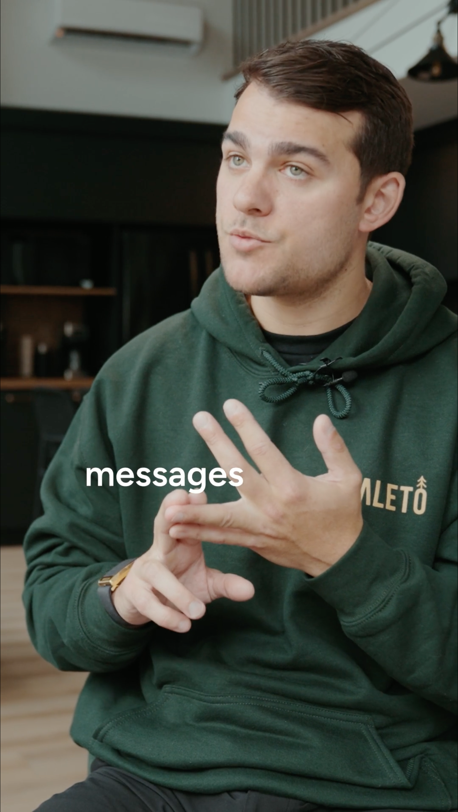
            <img src="assets/footage/testimonial-thumb.png" alt="" draggable="false" style={{ position: "absolute", inset: 0, width: "100%", height: "100%", objectFit: "cover", objectPosition: "center 28%" }} />
            <div style={{ position: "absolute", inset: 0, background: "linear-gradient(transparent 52%, rgba(0,0,0,0.82))" }} />
            <PcPlay d={56} />
            <div style={{ position: "absolute", left: 20, right: 20, bottom: 20 }}>
              <div style={{ font: "600 15px/1.2 var(--font-sans)", color: "#fff" }}>Customer testimonial</div>
              <div style={{ font: "400 13px/1.3 var(--font-sans)", color: "rgba(255,255,255,0.72)", marginTop: 3 }}>Filmed once. Reused across campaigns.</div>
            </div>
          </div>
        </div>
      </div>
    </section>
  );
}

// ─── WHAT YOU ACTUALLY GET — horizontal delivery panel ──────────────────────
function FlowTx() {
  return (
    <div className="mv2-tx">
      <span className="ln a"></span>
      <span className="sel"><span className="ln"></span></span>
      <span className="ln b"></span>
    </div>
  );
}
function FlowEdit() {
  return (
    <div className="mv2-tl">
      <div className="track">
        <span className="clip" style={{ width: "34%" }}></span>
        <span className="clip" style={{ width: "20%" }}></span>
        <span className="clip" style={{ width: "40%" }}></span>
        <span className="head"></span>
      </div>
      <div className="cap">
        <i style={{ width: "52%" }}></i>
        <i style={{ width: "30%" }}></i>
      </div>
    </div>
  );
}
function FlowFrames() {
  return (
    <div className="mv2-fr">
      <figure><span className="bx v"></span><figcaption>9:16</figcaption></figure>
      <figure><span className="bx s"></span><figcaption>1:1</figcaption></figure>
      <figure><span className="bx w"></span><figcaption>16:9</figcaption></figure>
    </div>
  );
}
function FlowReady() {
  const rows = ["Angle", "Edit", "Formats"];
  return (
    <div className="mv2-ck">
      {rows.map((r, i) => (
        <div key={i} className="row"><span className="ck"><IcCheck s={11} /></span>{r}</div>
      ))}
    </div>
  );
}

const WY_CSS = `
  .wy-sec { background:#fff; }
  .wy-wrap { max-width:var(--pc-max); margin:0 auto; padding:clamp(72px,9vw,120px) var(--pc-pad); }

  /* promise / payoff headline — centered typography, no surface */
  .wy-promise { max-width:900px; margin:0 auto; text-align:center; padding:clamp(4px,1vw,16px) 0; }
  .wy-h2 { font:700 clamp(36px,4.8vw,64px)/1.02 var(--font-sans); letter-spacing:-0.04em; color:var(--text-primary); margin:20px 0 0; text-wrap:balance; }
  .wy-h2 .wl { display:block; }
  .wy-h2 em { font-style:normal; color:var(--brand-600); }
  .wy-sub { font:400 clamp(17px,1.8vw,20px)/1.5 var(--font-sans); letter-spacing:-0.01em; color:var(--text-secondary);
    margin:20px auto 0; max-width:50ch; text-wrap:pretty; }

  /* center-line rhythm — the page's thin vertical alignment tick */
  .wy-lead { width:1px; height:clamp(40px,4.4vw,58px); margin:clamp(34px,4vw,54px) auto; background:rgba(20,18,16,0.16); }
  .wy-lead.is-top { margin-top:0; }

  /* three workflow steps — typographic columns, no cards */
  .wy-steps { display:grid; grid-template-columns:repeat(3,1fr); gap:clamp(28px,4vw,56px); margin-top:clamp(40px,4.4vw,60px); }
  .wy-step { padding-top:24px; border-top:1.5px solid rgba(20,18,16,0.13); }
  .wy-step .n { font:700 13px/1 var(--font-sans); letter-spacing:.16em; color:var(--brand-600); font-variant-numeric:tabular-nums; }
  .wy-step h4 { font:700 clamp(27px,3vw,38px)/1.0 var(--font-sans); letter-spacing:-0.04em; color:var(--text-primary); margin:18px 0 0; }
  .wy-step p { font:400 clamp(14px,1.5vw,15px)/1.55 var(--font-sans); color:var(--text-secondary); margin:18px 0 0; max-width:32ch; text-wrap:pretty; }

  /* outcome line — the result of step 03, not a step */
  .wy-out { margin-top:clamp(40px,4.4vw,60px); padding-top:clamp(30px,3.4vw,44px); border-top:1.5px solid rgba(20,18,16,0.13); text-align:center; }
  .wy-out h4 { font:700 clamp(22px,2.6vw,32px)/1.12 var(--font-sans); letter-spacing:-0.035em; color:var(--text-primary); margin:0; text-wrap:balance; }
  .wy-out h4 em { font-style:normal; color:var(--brand-600); font-variant-numeric:tabular-nums; white-space:nowrap; }

  .wy-proof { display:flex; flex-wrap:wrap; align-items:center; justify-content:center; gap:11px 16px; margin:22px 0 0; }
  .wy-proof span { font:400 14px/1.3 var(--font-sans); color:var(--text-tertiary); }
  .wy-proof i { width:4px; height:4px; border-radius:99px; background:var(--line); flex:none; }

  @media (max-width:820px) {
    .wy-steps { grid-template-columns:1fr; gap:0; }
    .wy-step { padding:24px 0; }
    .wy-step:first-child { padding-top:24px; }
    .wy-lead { height:40px; margin:30px auto; }
  }
  @media (max-width:767px) {
    .wy-wrap { padding:48px var(--pc-pad); }
    .wy-h2 { font-size:30px; }
    .wy-sub { margin-top:14px; text-align:center; }
    .wy-step { padding:18px 0; }
    .wy-step h4 { margin-top:12px; }
    .wy-step p { margin-top:11px; }
    .wy-lead { height:28px; margin:6px auto; }
    .wy-out { margin-top:24px; padding-top:24px; }
    .wy-proof { margin-top:16px; }

    /* mobile workflow — premium vertical flow card */
    .wy-wrap-m { padding:46px 16px 40px; }
    .wym2-card { margin:30px 0 0; background:#fff; border:1px solid var(--line);
      border-radius:18px; padding:12px 28px 10px; box-shadow:0 16px 44px rgba(20,18,16,0.07); }
    .wym2-step { position:relative; display:grid; grid-template-columns:44px 1fr; gap:20px;
      padding:34px 0; }
    .wym2-step:last-child { padding-bottom:28px; }
    /* continuous flow connector running down through the number gutter */
    .wym2-step::before {
      content:""; position:absolute; left:21px; top:50px; bottom:-4px; width:2px;
      transform:translateX(-50%); background:rgba(20,18,16,0.2); }
    .wym2-step:last-child::before { bottom:-17px; }
    .wym2-num { position:relative; z-index:1; align-self:start; background:#fff;
      font:700 32px/1 var(--font-sans); color:var(--brand-600);
      font-variant-numeric:tabular-nums; letter-spacing:-0.02em; padding-bottom:8px; }
    .wym2-body h4 { font:700 28px/1.1 var(--font-sans); letter-spacing:-0.03em;
      color:var(--text-primary); margin:0; }
    .wym2-body p { font:400 19px/1.5 var(--font-sans); color:var(--text-secondary);
      margin:9px 0 0; text-wrap:pretty; }

    /* payoff — the final OUTPUT of 01→02→03: sits on the flow line, off-white */
    .wym2-result { position:relative; margin:14px 0 0; background:#F5F7F5; border:1px solid var(--line);
      border-radius:18px; padding:32px 28px; display:grid; grid-template-columns:42px 1fr; gap:18px;
      align-items:center; }
    /* the vertical flow line continues from the steps down into this card, ending at the check */
    .wym2-result::before { content:""; position:absolute; left:49px; top:-18px; height:72px; width:2px;
      transform:translateX(-50%); background:rgba(20,18,16,0.2); z-index:0; }
    .wym2-result .chk { position:relative; z-index:1; width:42px; height:42px; border-radius:50%;
      background:var(--brand-600); color:#fff; display:flex; align-items:center; justify-content:center;
      box-shadow:0 6px 16px rgba(255,35,140,0.24); }
    .wym2-result h4 { font:700 29px/1.1 var(--font-sans); letter-spacing:-0.03em;
      color:var(--text-primary); margin:0; }

    /* tighten the hand-off from the result card into Pricing (mobile only) */
    #pricing > .pc-wrap { padding-top:80px !important; }
  }
`;

function PcWhatYouGet() {
  const [ref, shown] = usePcReveal();
  const isMobile = usePcIsMobile();
  if (isMobile) {
    return (
      <section className="pc-sec wy-sec">
        <div ref={ref} className="wy-wrap wy-wrap-m">
          <div className="wy-promise" style={rise(shown, 40)}>
            <Cap>The Workflow</Cap>
            <h2 className="wy-h2">
              <span className="wl">Choose the direction.</span>
              <span className="wl"><em>Sayso handles the rest.</em></span>
            </h2>
            <p className="wy-sub">You get suggested directions. Choose one, adjust it, or build your own.</p>
          </div>
          <div className="wym2-card" style={rise(shown, 140, 16)}>
            <div className="wym2-step">
              <div className="wym2-num">01</div>
              <div className="wym2-body">
                <h4>Get your options</h4>
                <p>Suggested directions based on the customer's actual words.</p>
              </div>
            </div>
            <div className="wym2-step">
              <div className="wym2-num">02</div>
              <div className="wym2-body">
                <h4>Choose your direction</h4>
                <p>Pick one, combine angles, or build your own.</p>
              </div>
            </div>
            <div className="wym2-step">
              <div className="wym2-num">03</div>
              <div className="wym2-body">
                <h4>Get your clips</h4>
                <p>Edited, captioned, framed, and ready to run.</p>
              </div>
            </div>
          </div>

          <div className="wym2-result" style={rise(shown, 300)}>
            <span className="chk"><IcCheck s={18} /></span>
            <h4>Final clips.<br />Ready to run.</h4>
          </div>
        </div>
      </section>
    );
  }
  return (
    <section className="pc-sec wy-sec">
      <div ref={ref} className="wy-wrap">
        <div className="wy-promise" style={rise(shown, 40)}>
          <Cap>The Workflow</Cap>
          <h2 className="wy-h2">
            <span className="wl">Choose the direction.</span>
            <span className="wl"><em>Sayso handles the rest.</em></span>
          </h2>
          <p className="wy-sub">You get suggested directions. Choose one, adjust it, or build your own.</p>
        </div>

        <div className="wy-steps">
          <div className="wy-step" style={rise(shown, 140, 18)}>
            <div className="n">01</div>
            <h4>Get your<br /><span style={{ color: "#ff238c" }}>options.</span></h4>
            <p>Suggested directions based on the customer's actual words.</p>
          </div>
          <div className="wy-step" style={rise(shown, 190, 18)}>
            <div className="n">02</div>
            <h4>Choose your<br /><span style={{ color: "rgb(255, 36, 140)" }}>direction.</span></h4>
            <p>Pick one, adjust the message, select multiple angles, or build your own.</p>
          </div>
          <div className="wy-step" style={rise(shown, 240, 18)}>
            <div className="n">03</div>
            <h4>Get your<br /><span style={{ color: "#ff238c" }}>clips.</span></h4>
            <p>Your clips come back edited, captioned, framed, and ready to run.</p>
          </div>
        </div>

        <div className="wy-out" style={rise(shown, 320)}>
          <h4>Final clips. Ready to run.</h4>
        </div>

        <div className="wy-proof" style={rise(shown, 360)}>
          <span>No extra shoot.</span><i></i><span>No editor chase.</span><i></i><span>No production management.</span>
        </div>
      </div>
    </section>
  );
}

// ─── WHEN TO USE ─────────────────────────────────────────────────────────────
function PcWhenToUse() {
  const [ref, shown] = usePcReveal();
  const channels = [
    ["01", "Paid", "Test customer angles.", "Run short proof points in paid campaigns."],
    ["02", "Sales", "Send focused proof.", "Give reps a 30-second customer answer after the first call."],
    ["03", "Social", "Feed-native clips.", "Turn real customer language into short social posts."],
    ["04", "Landing", "Proof near the CTA.", "Place customer proof at the decision point."],
  ];
  return (
    <section className="pc-sec" style={{ background: "#fff" }}>
      <style>{CHA_CSS}</style>
      <div ref={ref} className="pc-wrap" style={{ padding: "120px var(--pc-pad) 0" }}>
        <div style={{ maxWidth: 680, ...rise(shown, 0) }}>
          <Cap>Channel Alignment</Cap>
          <h2 className="pc-h2">Give every channel the proof it demands.</h2>
        </div>
        <div className="cha">
          {channels.map(([n, ch, lead, sub], i) => (
            <div key={i} className="cha-row" style={rise(shown, 120 + i * 70, 16)}>
              <div className="cha-label">
                <span className="cha-num">{n}</span>
                <span className="cha-ch">{ch}</span>
              </div>
              <div className="cha-copy">
                <div className="cha-lead">{lead}</div>
                <p className="cha-sub">{sub}</p>
              </div>
            </div>
          ))}
        </div>
      </div>
    </section>
  );
}

const CHA_CSS = `
  .cha { margin-top:56px; border-top:1px solid rgba(0,0,0,0.12); }
  .cha-row { display:grid; grid-template-columns:0.82fr 1.5fr; gap:clamp(24px,5vw,80px); align-items:center;
    padding:30px 8px; border-bottom:1px solid rgba(0,0,0,0.12); position:relative;
    transition:background .25s cubic-bezier(.2,0,0,1); }
  .cha-row:hover { background:rgba(0,0,0,0.018); }
  .cha-label { display:flex; align-items:baseline; gap:16px; }
  .cha-num { font:700 13px/1 var(--font-sans); letter-spacing:.06em; color:var(--brand-600); font-variant-numeric:tabular-nums; flex:none; }
  .cha-ch { font:700 clamp(32px,4.4vw,56px)/0.98 var(--font-sans); letter-spacing:-0.045em; color:var(--text-primary); }
  .cha-lead { font:600 clamp(19px,2.1vw,25px)/1.18 var(--font-sans); letter-spacing:-0.03em; color:var(--text-primary); text-wrap:balance; }
  .cha-sub { font:400 clamp(15px,1.6vw,17px)/1.5 var(--font-sans); color:var(--text-secondary); margin:9px 0 0; max-width:48ch; text-wrap:pretty; }

  @media (max-width:720px) {
    .cha { margin-top:40px; }
    .cha-row { grid-template-columns:1fr; gap:12px; padding:24px 4px; }
    .cha-ch { font-size:32px; }
    .cha-lead { font-size:19px; }
  }
`;

// ─── CLOSING CTA — wide, airy white conversion moment ────────────────────────
function PcOperational() {
  const [ref, shown] = usePcReveal();
  const isMobile = usePcIsMobile();
  return (
    <section className="pc-sec cta2">
      <div ref={ref} className="cta2-in">
        <div style={rise(shown, 0)}><Cap dark>Start now</Cap></div>
        <h2 className="cta2-h" style={rise(shown, 60)}>
          {isMobile ? (
            <React.Fragment>
              <span className="wl">Turn one customer shoot</span>
              <span className="wl">into <span className="pk">ads</span> your</span>
              <span className="wl">team can run.</span>
            </React.Fragment>
          ) : (
            <React.Fragment>
              <span className="wl">Turn one customer shoot</span>
              <span className="wl">into <span className="pk">Testimonial Ads</span></span>
              <span className="wl">your team can run.</span>
            </React.Fragment>
          )}
        </h2>
        <p className="cta2-sub" style={rise(shown, 110)}>
          {isMobile
            ? "Add Testimonial Ads to your shoot and get short customer-proof ads for paid, social, landing pages, and sales."
            : "Add Testimonial Ads to your shoot and get short customer-proof clips for paid, social, landing pages, and sales."}
        </p>
        <div className="cta2-act" style={rise(shown, 160)}>
          <button className="pc-btn pc-btn-pri" type="button" onClick={() => window.pcGo(window.PC_LINKS.buyClips)}>
            {isMobile ? "Add Testimonial Ads" : "Add Testimonial Ads"} <ArrowUR />
          </button>
          <a href={window.PC_LINKS.planningCall} className="cta2-link">
            {isMobile ? "Book a meeting" : "Don't have a testimonial yet? Book a 10-minute planning call"}
          </a>
        </div>
        <div className="cta2-chips" style={rise(shown, 210)}>
          {["Global", "Fast", "Zero production management"].map((m, i) => (
            <span key={i} className="cta2-chip"><span className="d"></span>{m}</span>
          ))}
        </div>
      </div>
    </section>
  );
}

// ─── OPERATIONAL RULE — how it works, sets up pricing (Chapter 3 open) ───────
function PcOpRule() {
  const [ref, shown] = usePcReveal();
  const steps = [
    ["01", "We scan the shoot", "Interview, b-roll, and real moments."],
    ["02", "You get 3 directions", "Suggested angles for paid, social, or sales."],
    ["03", "You choose or build", "Pick one, several, or create your own mix."],
    ["04", "We produce", "3 formats, captions, and review included."],
  ];
  return (
    <section className="pc-sec" style={{ background: "#EAEBE7" }}>
      <div ref={ref} className="pc-wrap" style={{ padding: "140px var(--pc-pad) 0", textAlign: "center" }}>
        <div style={rise(shown, 0)}><Cap>How it works</Cap></div>
        <h2 className="pc-h2 center" style={rise(shown, 70)}>Your film is done. <span className="pc-pink">Your clip directions are ready.</span></h2>
        <p className="pc-lead center" style={rise(shown, 120)}>No new shoot. We find the campaign moments, you choose the direction, and our editors produce the clips.</p>
        <div className="pc-opsteps" style={rise(shown, 180)}>
          {steps.map(([n, t, d], i) => (
            <div key={i} className="pc-opstep">
              <span className="sn">{n}</span>
              <h4>{t}</h4>
              <p>{d}</p>
            </div>
          ))}
        </div>
      </div>
    </section>
  );
}

// ─── SYSTEM BRIDGE → global coverage (Chapter 3 close) ───────────────────────
function PcSysBridge() {
  const [ref, shown] = usePcReveal();
  return (
    <section className="pc-sec" style={{ background: "#EAEBE7" }}>
      <div ref={ref} className="pc-wrap" style={{ padding: "104px var(--pc-pad) 64px", textAlign: "center" }}>
        <p className="pc-bridge" style={rise(shown, 0)}>Built to repeat across <b>every market.</b></p>
      </div>
    </section>
  );
}

Object.assign(window, { PC1_CSS, WY_CSS, PcLogoWall, PcClosingProof, PcWhatYouGet, PcWhenToUse, PcOperational, PcOpRule, PcSysBridge });
